I wanted to do some research into video game title screens and main menus, as I thought that a main menu screen could work really well at portraying the screenshots I took as a real video game. I picked out games which have very similar environments to mine, these games usually portray a very atmospheric game world and therefore the main menu screens reflect this.

|
This is the title screen from the award winning PlayStation 3 game 'The Last Of Us' which featured a very atmospheric environment similar to the one I am creating.
The title screen features a very atmospheric scene showing a slightly open window with overgrown leaves coming through and sun rays highlighting the dust floating around the room. The typography is quite simplistic and works really well with the image, the block sans serif font used looks professional and serious. |

|
This is the title screen from the Firewatch game which I researched . It was a great inspiration in my project as it features some really rich and atmospheric natural environments.
The main menu features a screenshot from the game showing a really calm mountain scene with the rocks and watch tower only taking up a small amount of space. The typography which is placed in the area of the screen which features blank sky is also quite simplistic with a block sans serif font just like the other one with a minimalistic logo around it. |

|
This is the main menu from a popular indie game called The Long Dark which features stylised natural environments similar to Firewatch. The title screen features a screenshot of one of the environments in the game which has calm atmosphere.
The typography is once again very simplistic with a block sans serif font which also has a slight transparency so that it doesn't distract from the screenshot. There is a slightly transparent white overlay to show that the 'story' button has been selected, which looks quite nice with the layout. |

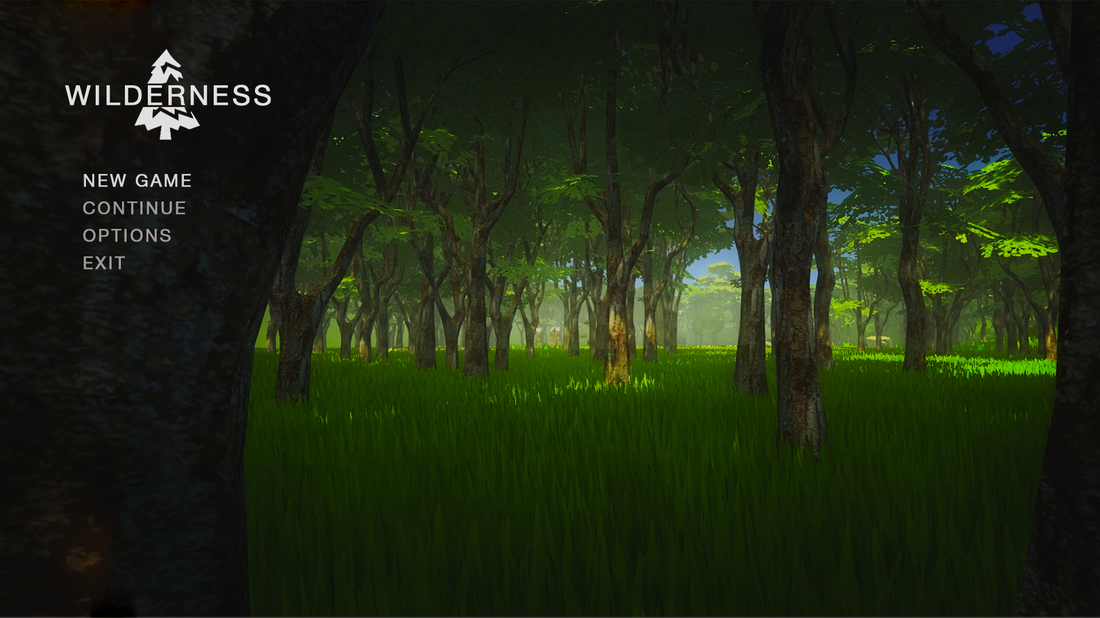
This is my attempt at creating a title screen similar to that of The Long Dark. I think I succeeded quite well at creating an atmospheric looking main menu with a simplistic layout and typography. I also attempted recreating the white overlay effect on the option that has been selected which looks quite good and makes it quite convincing that it is a real game title screen.
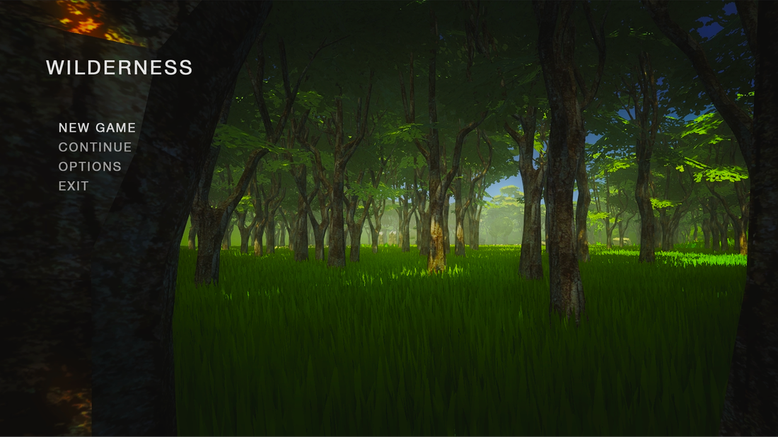
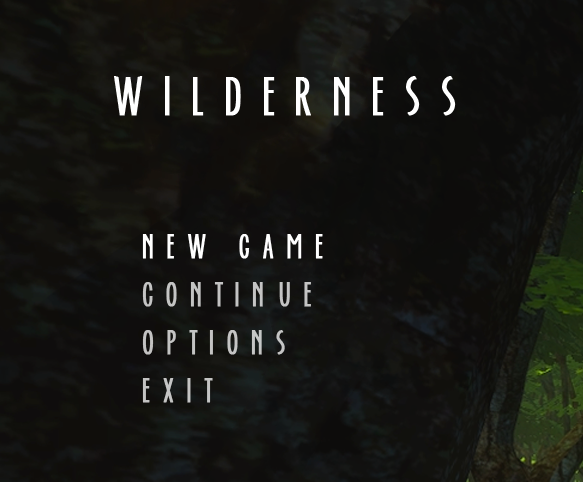
I tried a similar approach with a different screenshot, featuring a much darker forest environment. The layout is similar to The Last Of Us game menu and looks really simple and minimalistic which fits the calm and tranquil atmosphere of the game. It is a really low-key layout and lets the player know that the game is atmospheric.
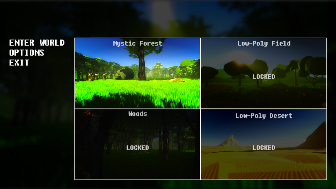
I wanted to try something different and created a more engaging and congested looking title screen. I created a 'choose your world' style system which would allow players to pick an environment to explore which they would have to unlock. The background is a darkened and blurred screenshot which creates a nice contrast with the typography and the smaller screenshots. The typography is simple and resembles older games with 8bit graphics which often featured text which looked like this. Although it looks quite good I don't think it reflects the atmosphere of my environments.
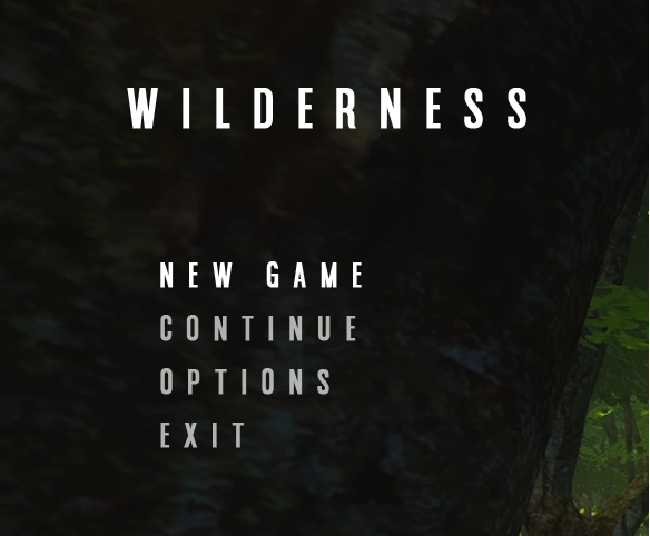
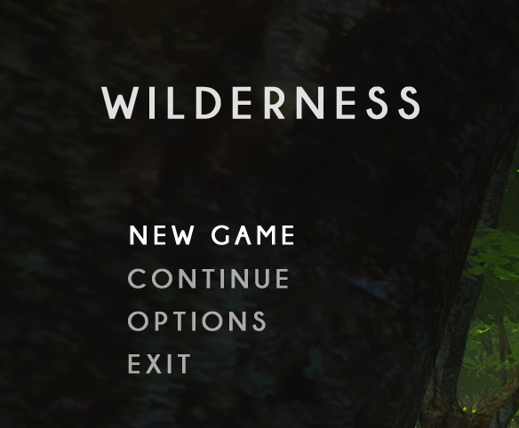
I picked out the experiments which I thought were the most convincing and reflected my theme well and I decided to develop them further by experimenting with the typography and creating a logo for it. The fonts I tried are all block sans serif and look really nice and simplistic.
|
This is a font called americana and it has a really simple block look. It looks quite good with the layout I created. The letters are thin and quite small so I had to adjust the tracking so that the typography fits well. I liked this font but I thought that it was a little to thin for the main menu and might be slightly difficult to read clearly. I wanted a font that is more eye catching and easy to read. |

|
I tried Helvetica as it is a very popular sans serif font and the result looks really. The font is wide eye catching and simple which fits what I wanted for the typography. It really complements the background image as it is simple and doesn't take too much attention but makes a convincing video game title screen. |
|
This font called Ever After has a more wavy style and is also thinner than Helvetica. It looks more interesting than the other fonts and could reflect the wavy natural look of the branches in the forest trees. I thought that this was a really nice looking font but it was slightly too thin to fit the menu well and I think that the Helvetica font looks much better in the layout. |


|

|
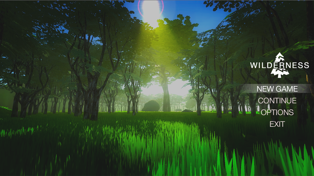
I decided to experiment with creating a logo for my game title screen. I took a screenshot of one of my low-poly trees and created a white block image from it which I could then edit and create a simplistic logo with that would reflect the theme of my project.
After editing and adding some more depth to it by using negative space to suggest shading in the tree I applied it to my typography similarly to the Firewatch menu which has the typography cut through the logo. I think the outcome is a really convincing, simplistic main menu title screen.
The layout and typography work really well with the screenshots and convey to the player what my project will be about.
The layout and typography work really well with the screenshots and convey to the player what my project will be about.
This is the other title screen layout which I tried and with the logo applied looks really good and convincing.
